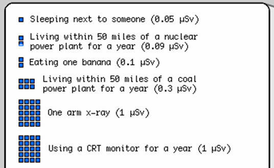
Radiation Dose Chart
Following the traumatic events last week in Japan, I was surprised by the media - both pleasantly and a bit worriedly, and how much coverage and focus was devoted to the nuclear accident(s) at Fukushima.
I say "pleasantly" with respect to how much detail was provided to help people understand what was going on - the New York Times did (and is still doing) an especially good job -- at providing detailed articles on various technical and social aspects, real-time updates, and impressive interactive animations like this one describing spent fuel pools.
I say "worriedly" with respect to how alarming some of the messages were - the European Commission likened the situation to an "Apocalypse", other sources claimed "Worse than Chrenobyl" ,... which we all knew was not the case - but - to be fair, even last Tuesday and Wednesday, it was uneasy to grasp that the situation was getting worse instead of better.
And through all this coverage, I think many of us felt that there was quite a lot of unclear and mixed messages about radiation and doses and limits and contamination ...
So yea, as the title of this post suggests, I just wanted to share this chart made by the guy who writes xkcd comics that I think does a pretty good job of putting radiation doses in perspective.
Here's a small glimpse of the chart to give you an idea of what it looks like: 
And FYI, the "Fukushima 50" , the workers that received the highest radiation doses received a maximum of 250mSv (this limit was extended by the Japanese Health and Labor Ministry in light of the situation, from a prior absolute maximum of 100mSv per year).
